Addicted to Every Possibility
Every design initiative comes with constraints built in. Naturally, timescales and budgets are immovable. Until they’re not. But rather than a mandate for limitless innovation, a project brief is often a catalogue of constraining parameters and non-negotiable (and often contradictory) aspirations and unverified assumptions that impose a point of view that is not always shared with the designers involved. Hence the endless discourse over the years about designers striving to earn and justify their ‘seat at the table’.
I’ve argued before that one of the primary responsibilities of any designer is to interrogate the brief. Better yet, we should be partners in writing them. But across various terrains of design practice, that isn’t always feasible. Solutions don’t take shape in isolation. Stakeholder needs, business logic, technical feasibility—all must be weighed and negotiated. Deadlines compete, resources are mustered and moved about, and strategies spin on a dime (to the joy of everyone involved).
And when working in the physical world, the constraints only multiply: materials, regulations, manufacturing processes, environmental impact, and sociocultural considerations come into play. Designers operating in the crowded centre of the Venn diagram where user needs, business goals, and technical innovation overlap could be forgiven for wishing for fewer constraints, not more.
Yet I would argue that there is real value in designers choosing to self-impose even more, albeit somewhat artificial, restrictions on their practice. Not to make life harder, but to sharpen our thinking. To trade shallow freedom for focused exploration.
Freedom in limitation
Constraints in digital design may take many forms: for example, limiting your colour palette or range of typographic variation, designing for edge devices or slow connections, enforcing strict adherence to AAA accessibility guidelines, or vetoing the use of certain components or patterns.
How would your design choices differ if you refused to display more than two user actions within the same view at the same time? How would you group and differentiate content if you disallowed the use of borders and shadows?
Far from being exercises in austerity, these limitations invite resourcefulness. They force a deeper reckoning with the fundamentals of structure, rhythm, and intention. They encourage inventiveness over rote repetition of existing patterns and standard practices.
Far from being exercises in austerity, these limitations invite resourcefulness. They force a deeper reckoning with the fundamentals of structure, rhythm, and intention. They encourage inventiveness over rote repetition of existing patterns and standard practices.
The Belgian design duo Muller Van Severen have developed, in a relatively short time, a signature aesthetic approach to their work. A strictly limited palette. A restricted selection of materials. But within that narrow range, they’ve produced a breadth of work that universally bears the inimitable stamp of its creators: floor lamps, cutting boards, dining tables, salt and pepper shakers, candle holders, bookshelves, sculptural works, and more.
Such constraints, rather than hindering creativity, provide a starting point. They encourage depth rather than breadth, an exploration of “everything one could do within these self-imposed limits; extremely focused, seeking maximum freedom, between controlled and unruly” (Borka).
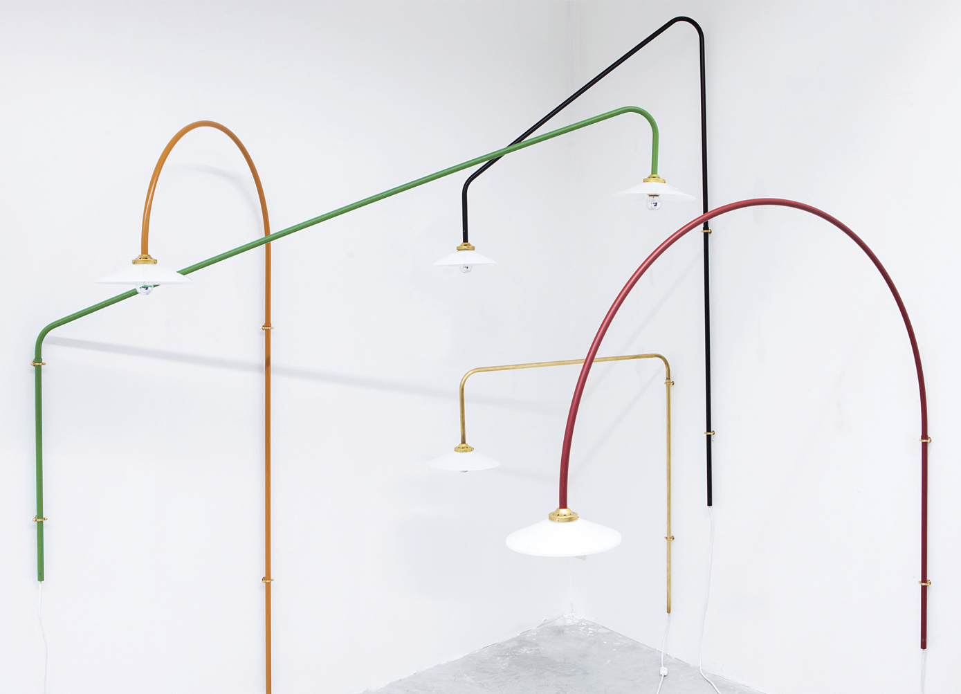
Hannes Van Severen’s father, the late Belgian designer Maarten Van Severen, espoused the ethos of becoming, within such self-imposed limits, “addicted to every possibility”. A philosophy shared by Hannes and his partner, Fien. Find freedom not in infinite choice, but in working a single seam until you strike gold: conducting dozens, even hundreds, of iterations within a tight parameter space—not in search of more, but in search of better.
Can you design a chair that isn’t torture to sit on using only one piece of tubular steel? What can be made with a few gnarled lengths of driftwood? A bookshelf? A bench? A shelter? How can you provide accessible medical treatment to communities that are inaccessible by road?
In the digital world, we rarely think in such elemental terms. But we could. When the mobile web was in its infancy, there were raging debates online about whether the sound approach to accommodating the expanding range of use contexts was to design for mobile first and ‘progressively enhance’ the experience for users with more capable devices or to design solutions that ‘gracefully degraded’ for those using clunky mobile browsers with poor resolutions and slow connection speeds.
Over a decade later, such discussions can seem almost parochial, but they were important. The web had been a wild west up until that point, with poorly regarded standards, flagrantly inaccessible interface designs, and bloated pages that took so long to load that it was necessary to design loading animations and (shudders) welcome pages.
The rise of the mobile web was a necessary inflection point that nudged the web design community towards maturity. It was also the beginning of what many consider to be the era of the boring web. But whose fault is that?
When we approach digital surfaces with the rigours of material constraints—designing not for pristine ideal cases but for loss, interruption, and failure—this should be seen as a creative challenge. What remains when you strip everything away? What is essential?
This isn’t minimalism for its own sake. It’s minimalism with purpose. As Dieter Rams would have it: less, but better. Not because less looks cool, but because it helps clarify intent. A composer, in choosing which notes to put into a piece of music, is also choosing which notes to leave out.
Constraints reduce noise, helping us hear the signal.
Practice and perfection
When I was studying music in my late teens, I would spend up to six hours a day practicing guitar (there was a period when, between houses, we were without Internet—a luxury I’ll never be afforded again). I kept several stacks of paper: one with musical keys, another with scales or modes, and a third with modifiers like "start on the A string" or "play in 3 positions on the neck." I’d shuffle them like cards and play whatever came out. A G# mixolydian in three octaves. A D minor 9 arpeggio starting from the D string. For hours, cycling through those seemingly endless combinations, steadily building fluency, accuracy, and speed.
Was it fun? Wouldn’t it have been nicer to just sit back and shred to Guns and Roses?
Anyone who has dedicated time to learning an instrument is familiar with activities like these. Cruel and tedious, but entirely worth it.
Design benefits from this same kind of practice. Exploring every combination within a tight set of variables isn’t just a way to find good solutions—it’s how we train our design muscle. It’s how we build intuition. Mastery doesn’t come from stumbling upon novelty, but from repetition, variation, and constraint.
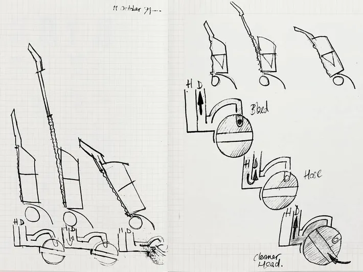
James Dyson supposedly spent fifteen years and 5,127 prototypes ‘perfecting’ (a term I doubt he himself would use) his design for a bagless vacuum cleaner that used cyclone technology: “It didn’t happen overnight, but after years of testing, tweaking, fist-banging, and after more than 5,000 prototypes, it was there.”
Dyson didn’t set out to simply design a better vacuum cleaner. He imposed an immovable constraint from the start—no bag, cyclone technology—and spent fifteen years addicted to every possibility within these parameters.
Dyson didn’t set out to simply design a better vacuum cleaner. He imposed an immovable constraint from the start—no bag, cyclone technology—and spent fifteen years addicted to every possibility within these parameters.
Imagine how much time he could have saved with the benefit of AI. More prototypes, less time. But AI cannot do the work for designers. Yes, it can generate endless variations, mock up ideas, and help us move faster. But the real gains only come through the grind.
RPGs (Role Playing Games) force gamers to spend hours battling enemies in order to level up and learn new skills. To start the game with max stats would not only defeat the point, but would extinguish all the fun and the satisfaction derived from the pursuit of mastery.
The grind is the game; the game is the grind. The slow, curious repetition. Failing and trying an alternate approach. Comparing methods. Breaking things and seeing what can be made with the pieces. It is too regularly forgotten that we never shake off the childhood tendency to learn through play and curiosity.
I’ve seen Goethe’s maxim “In der Beschränkung zeigt sich erst der Meister” translated two ways. Either that ‘only in limitation is the master revealed’, or ‘only in limitation does the master reveal themself’.
The distinction is subtle, but whilst one interpretation suggests that constraint exposes true talent, the other suggests that it is only through constraint that mastery is attained.
To ask AI to do this heavy lifting for us is to offload a responsibility that is essential to proper creative innovation. Human innovation. As Nobel Prize-winning economist Daron Acemoglu argues, the risk “is that AI will undermine our ability to learn, experiment, share knowledge, and derive meaning from our activities”.
The elimination of boring, rote tasks may be desirable, but there is a risk that the capacity for human critical thought and invention will be greatly diminished if our unthinking use of AI tools “discourages human inquiry and experiential learning”. AI can offer us scaffolding. It may help elevate us. But it cannot climb for us.
Further reading
- Acemoglu, D. (2025, March 4). Will we squander the AI opportunity? Project Syndicate. https://www.project-syndicate.org/commentary/ai-on-a-socially-harmful-path-by-daron-acemoglu-2025-02.
- Borka, Max. “The Dynasty That Sparked Muller Van Severen.” Damn, no. 90, p. 27.
- Kircher, Madison Malone. “James Dyson on His Vacuum Failure and Success.” The Vindicated, 22 Nov. 2016, nymag.com/vindicated/2016/11/james-dyson-on-5-126-vacuums-that-didnt-work-and-1-that-did.html.