The short tale
I enjoy connecting dots, interrogating concepts, and distilling complexity. For over sixteen years I’ve helped organisations from startups to global brands bring their ideas to life and connect humans through technology.
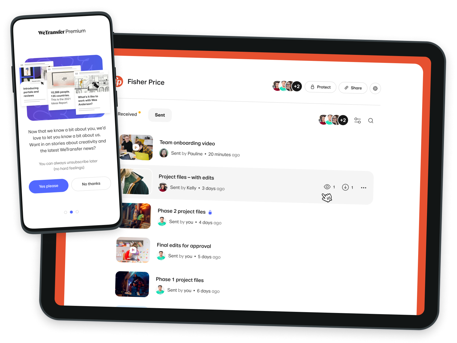
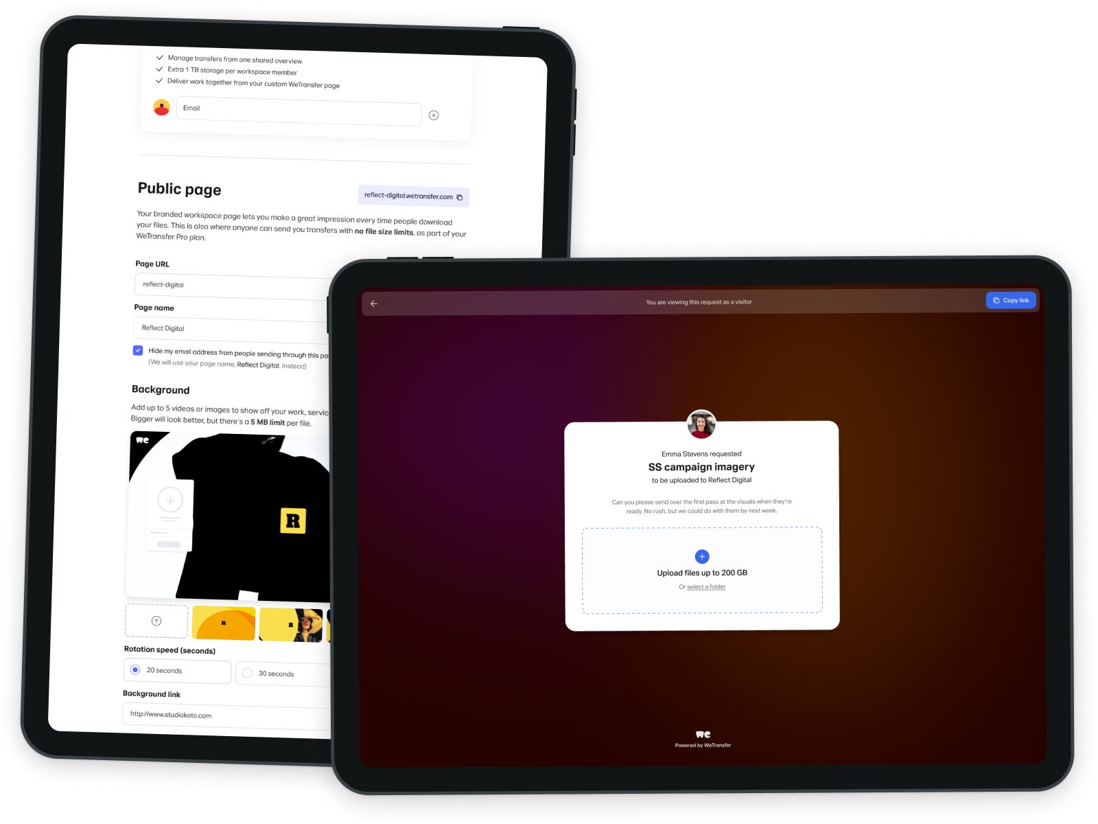
Most of the time this involves drawing lots of boxes in other boxes and calling it user experience, interaction, or product design. I currently do this idea-wrangling at QuillBot, and formerly at WeTransfer and Bliss.
I value design that is intentional, honest, and self-reflective. You can read my (over)thinking about this in some of my essays.